HAIR
Set Designer & Scenic Charge
Macalester College
2022
Produced for the Broadway stage by Michael Butler
Originally Produced by the New York Shakespeare Festival Theatre
HAIR is presented by arrangement with Concord Theatricals on behalf of Tams-Witmark LLC. www.concordtheatricals.com
Production Team
Director:
Stage Manager & Dramaturg:
Music Director:
Choreographer:
Scenic Designer:
Lighting Designer:
Projections and Media Designer:
Costume Designer:
Sound Designer:
Properties Designers:
Technical Director:
Poster Design:
Cláudia Tatinge Nascimento
Alexandra Whitman
Franco Holder
Karen L. Charles
Yunzhu (Jessica) Chen
Mitchell Frazier
Eliot Gray Fisher
MaryBeth Gagner
Lucas Martin
Rene'e Gonzales, Sandy Zhao
Tom Barrett
Yunzhu (Jessica) Chen
Photos by: Emily Fell
Edited by: Yunzhu (Jessica) Chen


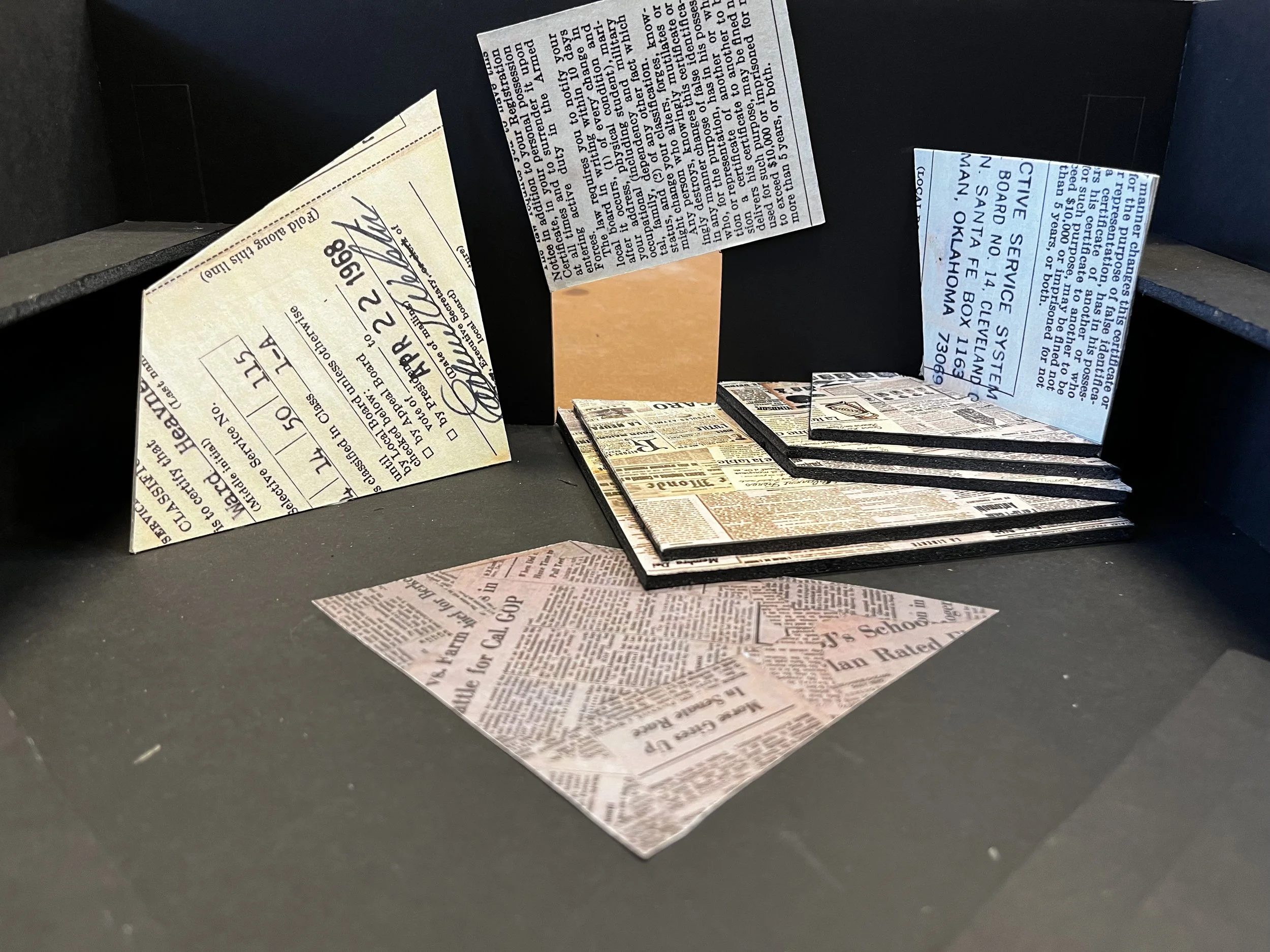
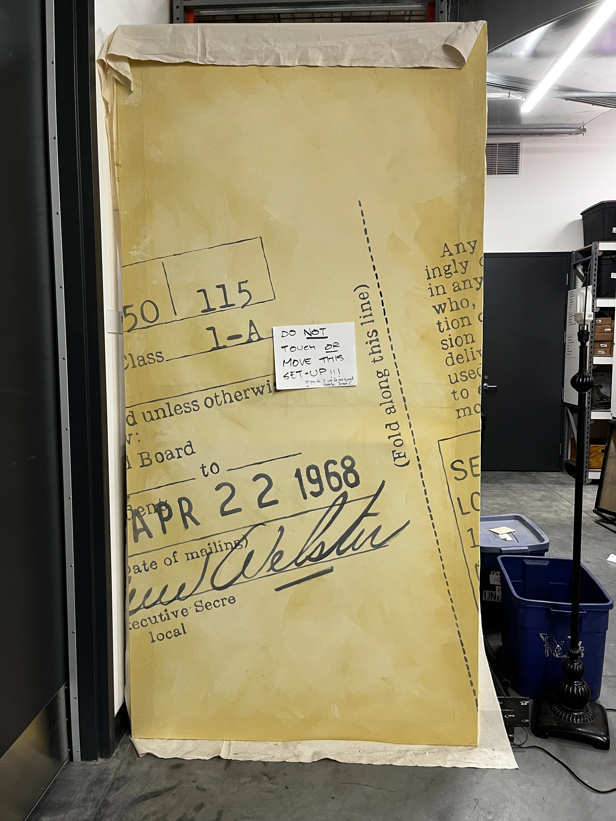
Draft cards + Newspapers
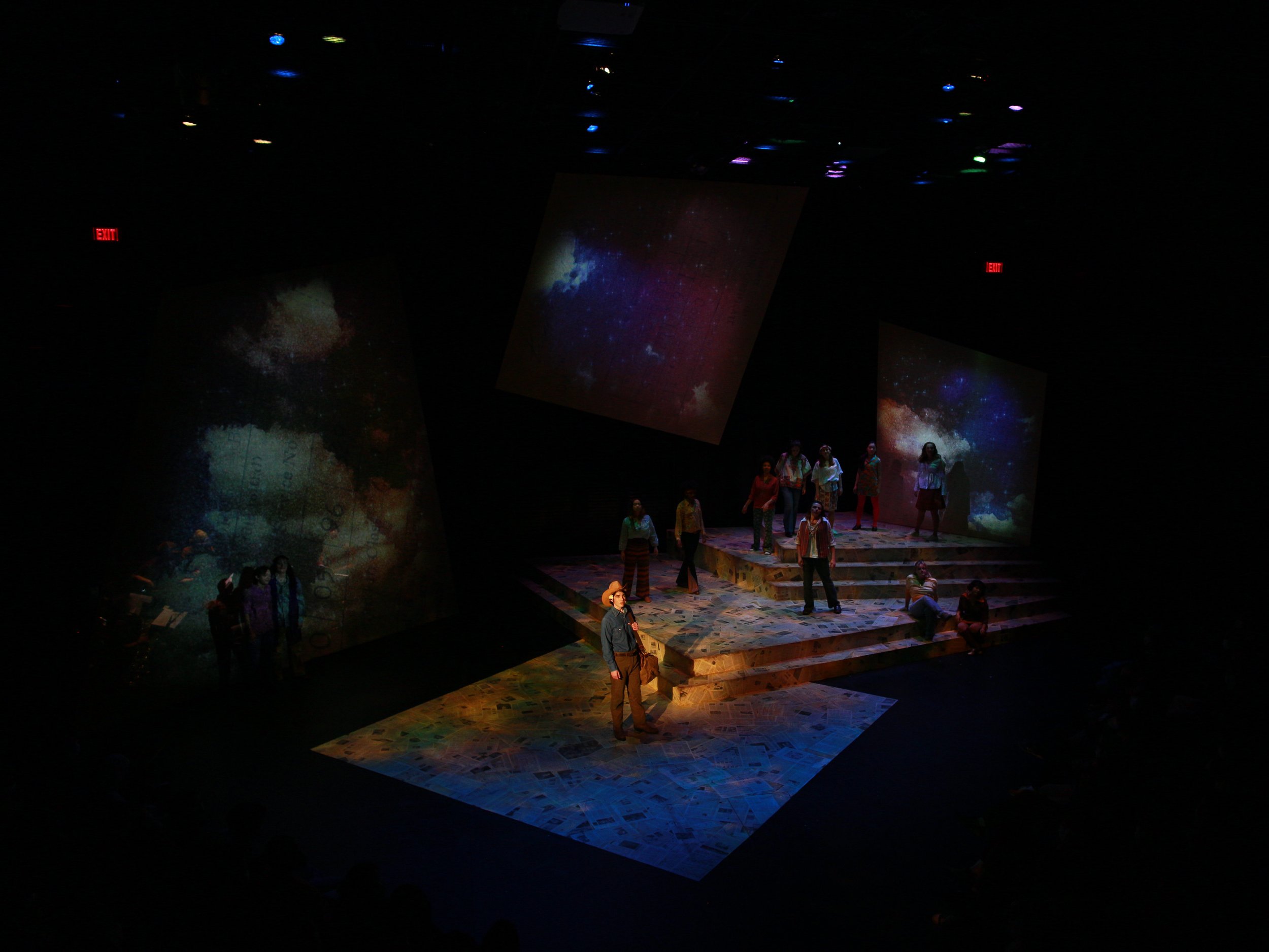
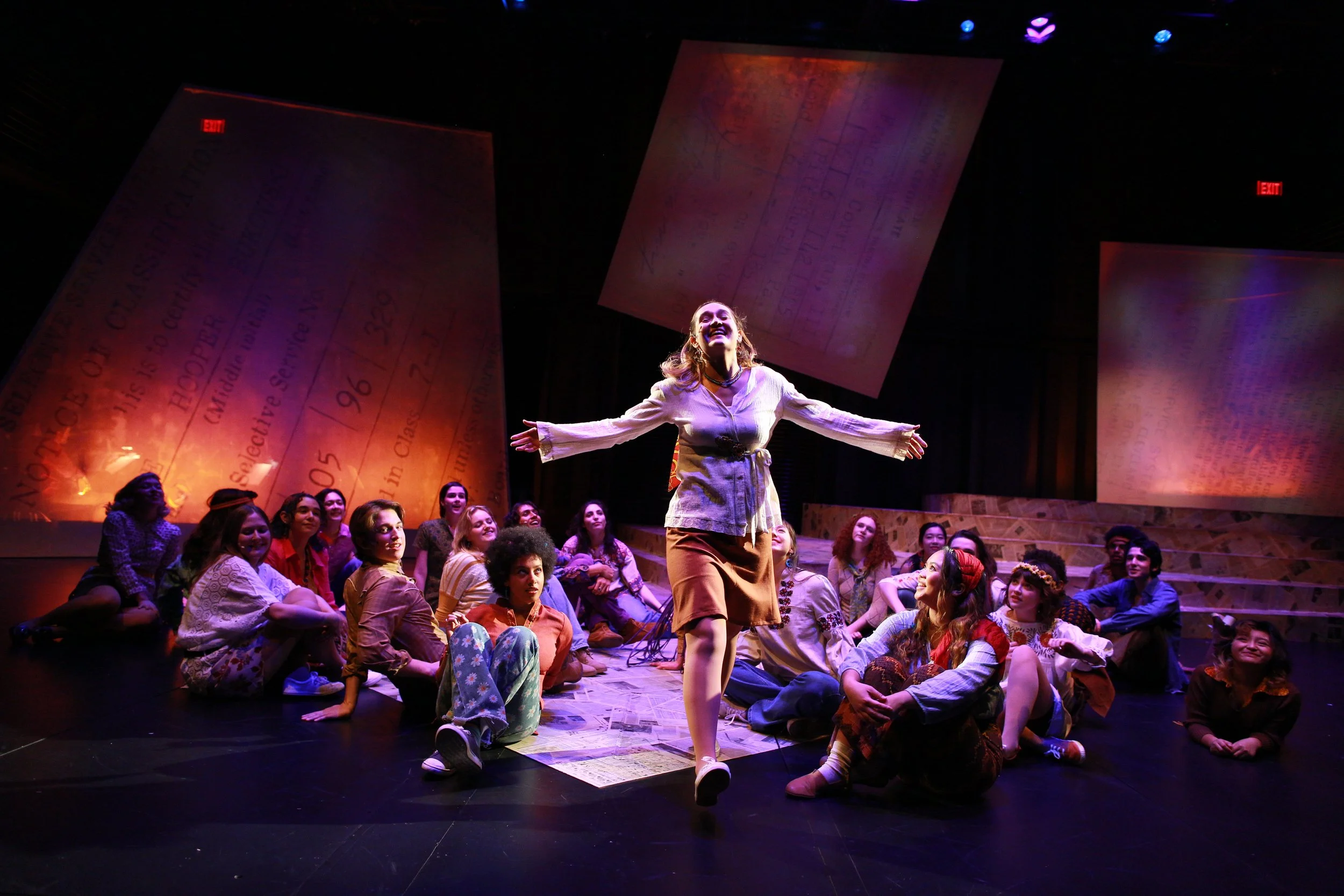
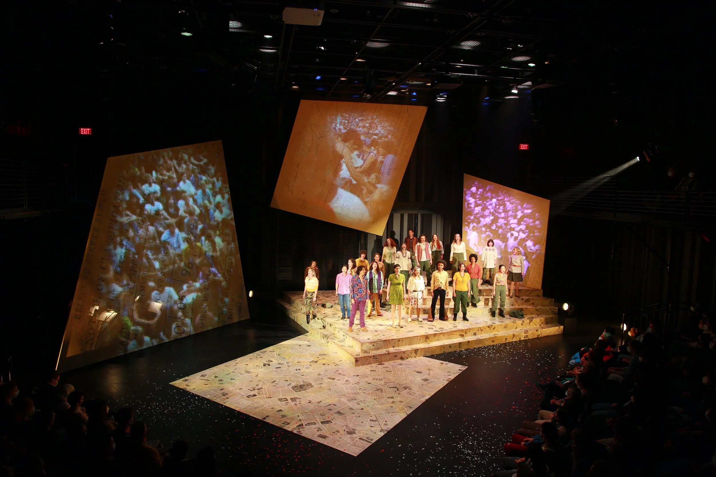
The director’s vision of the production focused on grounding the characters more in the historical reality while showcasing their flower power. To realize such vision, I decided to set the musical in an abstract place surrounded by draft cards of the soldiers who were being sent to the Vietnam War. The giant draft cards serve as a constant reminder of the grim truth the characters are facing. They are purposefully designed to never fade away entirely under the projections to embody the risks the young adults faced during the era.
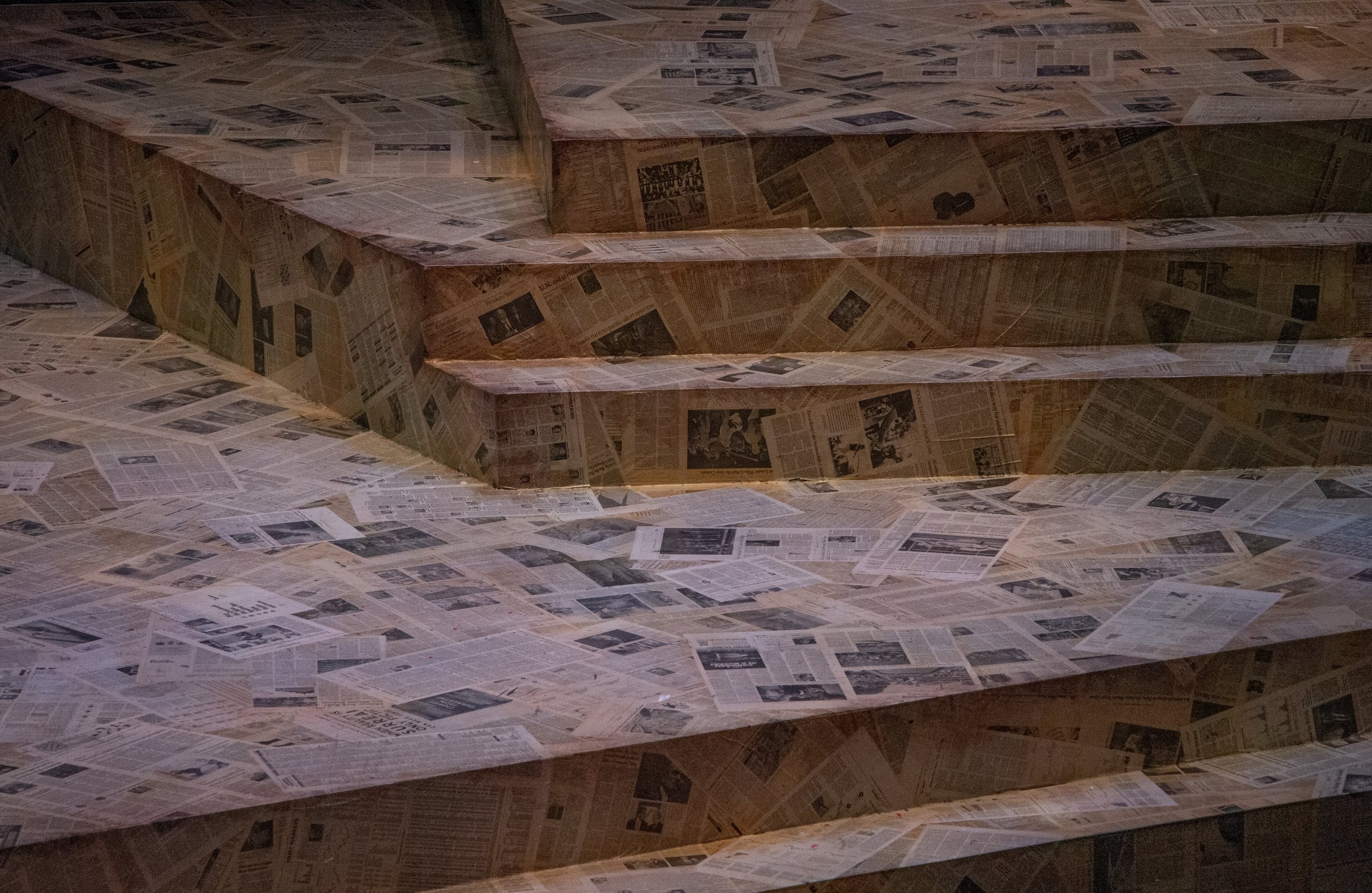
The floor is finished with current daily newspaper collages to further emphasize the historical nature of the play while drawing the connection to modern-day crises, such as the Russo-Ukrainian War.
Special Seating Configuration
After conversations with the director, it was decided that a sense of community and immersion cannot be achieved through standard proscenium arrangements. Thus, the decision was reached to change to this custom-designed triangular seating arrangement, taking full advantage of the flexibility of the black-box theater.
The central triangular deck between the seating banks gave additional playing space for the performers, extending the performance space into the audience. The deck also gave access to the upper balcony level through the main floor, allowing unique entrances and exits of characters.
<— Click for Drafting PDF
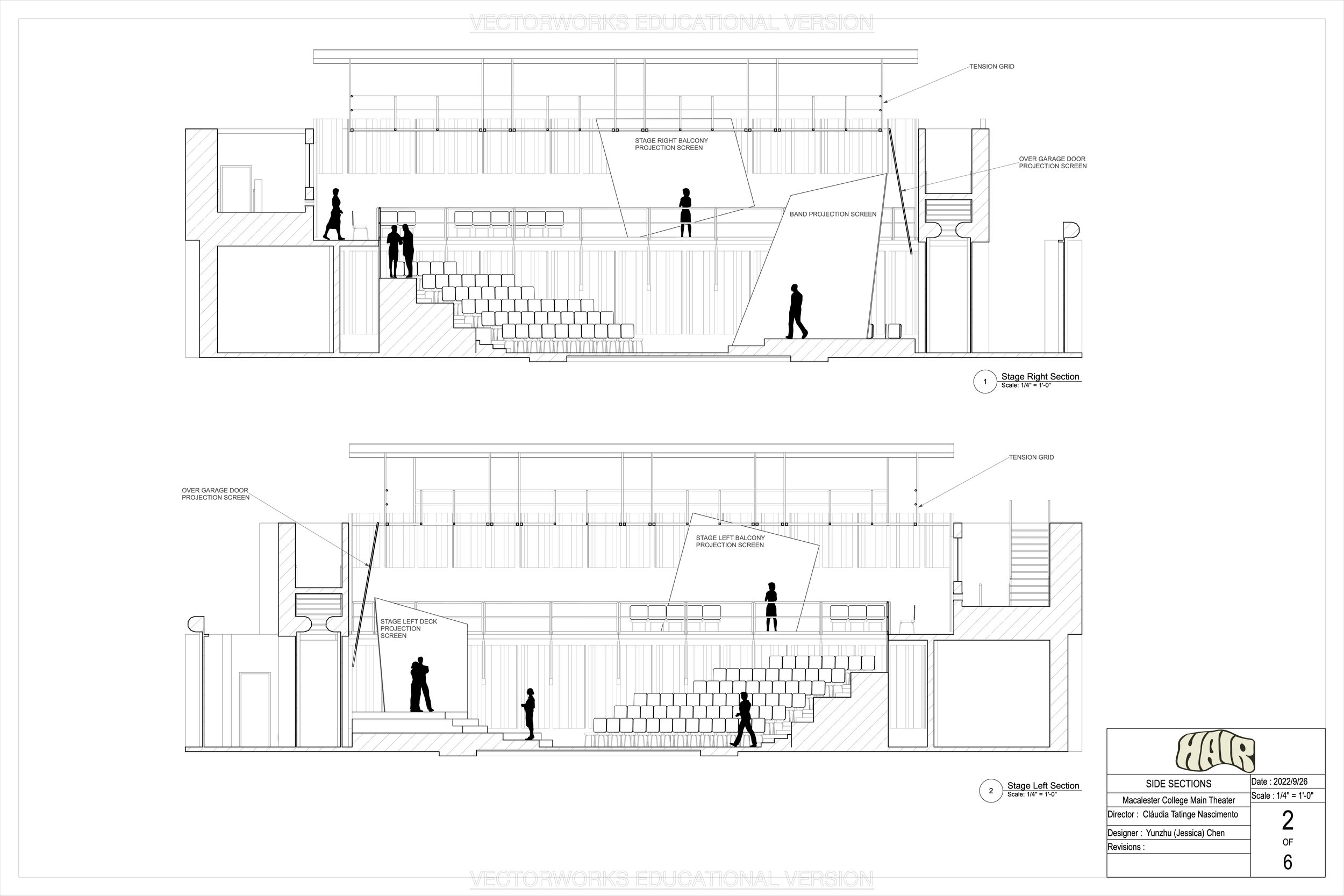
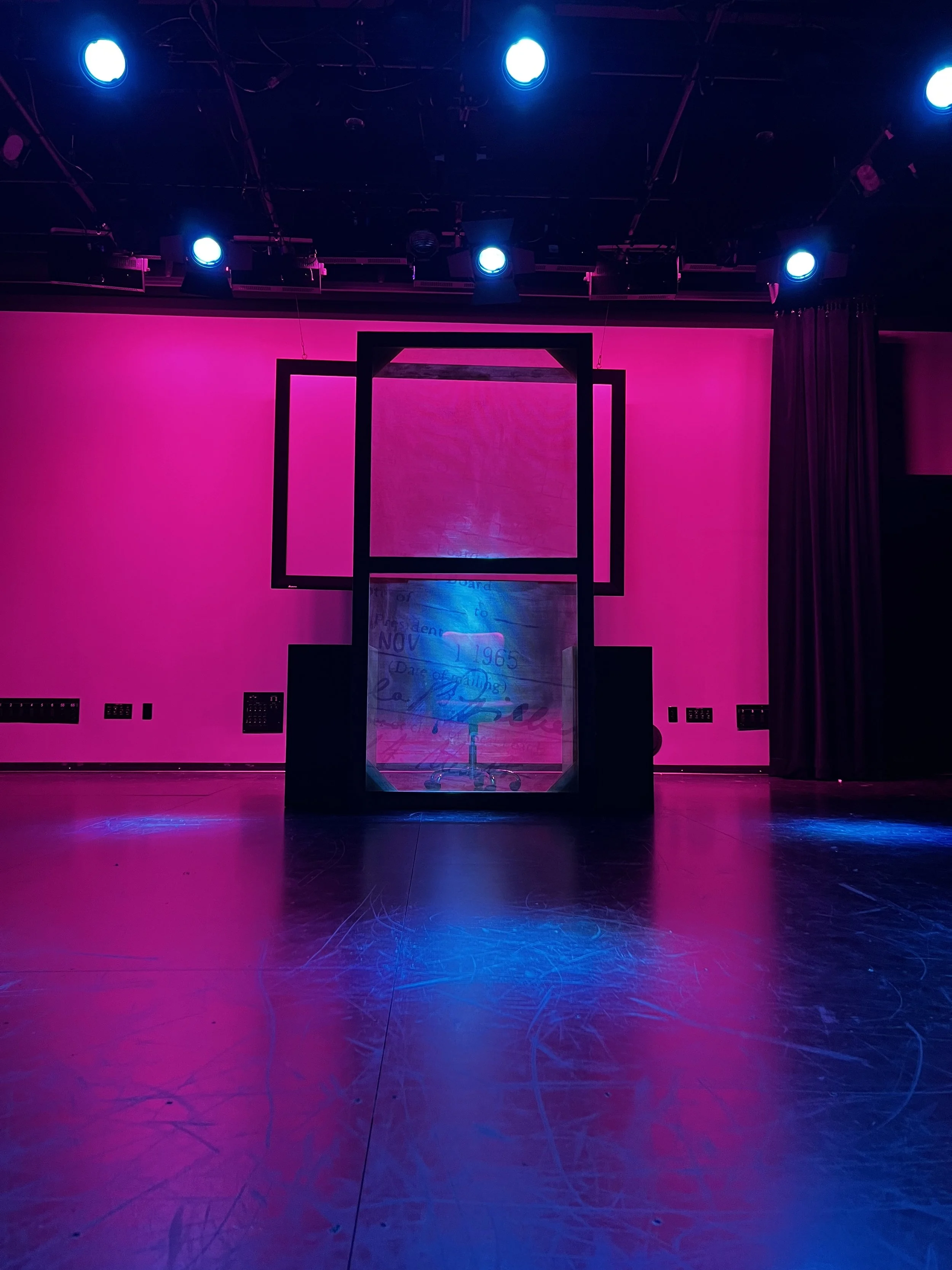
Projection screens
From the beginning, there was the decision to incorporate projection as part of the production, so the design of the set was based greatly on providing sufficient and good-quality projection surfaces.
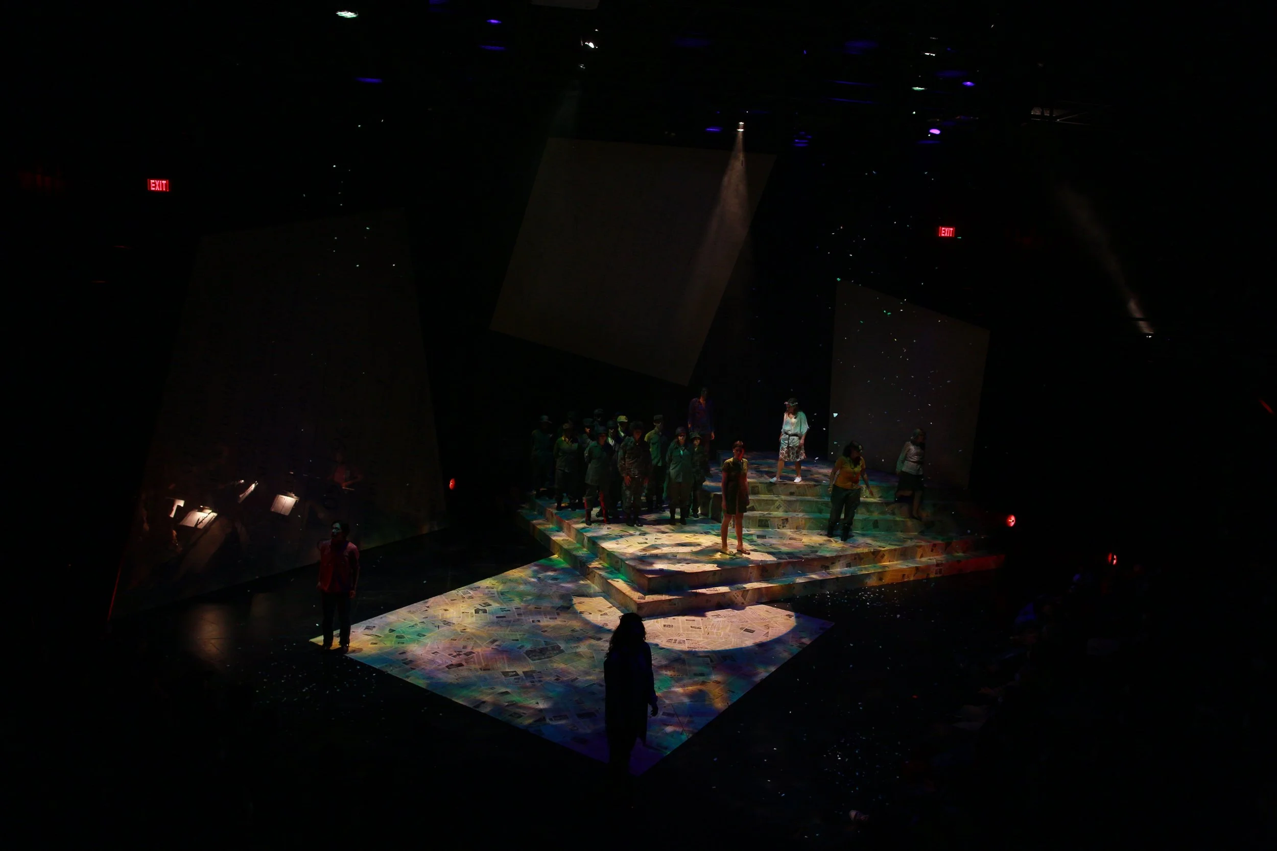
The final design included five giant draft cards as the projection surfaces placed in front and around the audience: three upstage and two on both stage-left and stage-right balconies. This maximized the feeling of immersion in the playing space for the projection designer while feeling like genuine set pieces without projection on them.
The largest surface in front of the band used scrim material so we can show or hide the band as needed.
Echoing the draft cards on the projection screens, the deck is faced with treated newspapers. The collage, as well as the draft cards, serves as an underlying reminder to the audience of the troubled reality the young flower children had to face even when they were lost in songs and drugs.
The newspaper, sourced from modern publications, also urges the audience to think about how the production is related to the war-prone world today.
The deck is elevated into different levels to create playing space at different heights on the main deck. Since the cast is quite large in this production, the height difference helps the characters to differentiate themselves from each other for the audience during chorus and group scenes.
The main deck, in connection with the triangular deck between the seating banks, created a pathing that went directly across the audience and brought them into the production as if they were part of the commune.
Progress
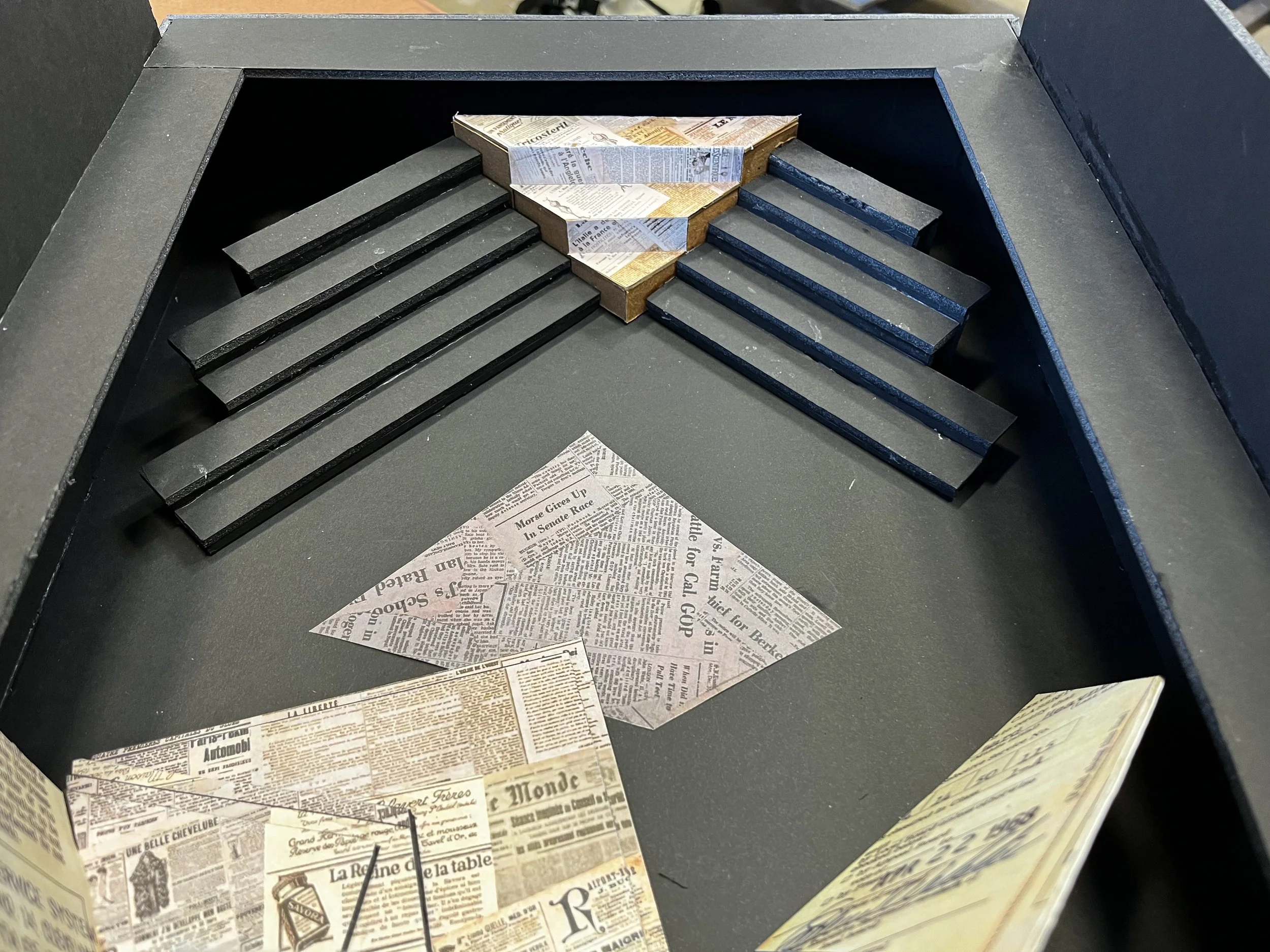
1/4” scale model built for showcasing the set to the production team and the cast.
I tested the background wash and the lettering on a 4’ by 8’ flats, both the muslin surface and the scrim surface, to check color values and tones before beginning work on the big screens.